HTML email width: 600px vs 800px
Use a 600–640px main container for most campaigns; maximum recommended width is 800px. It fits Outlook desktops, avoids horizontal scroll on mobile Gmail, and keeps copy readable. The html2email validator checks that container width does not exceed 800px.
Key Takeaways
-
✓
Set
width="600"on the main table and center it. -
✓
Wrap with a
div style="max-width: 600px; margin: 0 auto;"for responsive scaling. - ✓ Maximum recommended width is 800px; wider layouts risk horizontal scroll and client quirks.
- ✓ html2email validator flags container widths over 800px and outside the 600–800px guidance.
Use a 600–640px main container for most campaigns. It fits Outlook desktops, avoids horizontal scroll on mobile Gmail, and keeps copy readable. The maximum recommended width is 800px-beyond that you risk horizontal scroll and rendering issues in many clients (see e.g. KTS on Habr). Wider (700–800px) is fine for image-heavy designs; test and set a max-width wrapper. Our validator checks that container width does not exceed 800px.
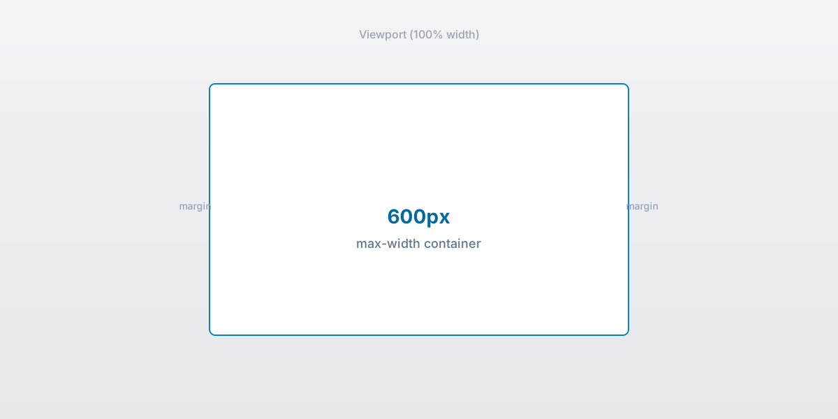
600px email container centered in the viewport.
Why 600–640px is the sweet spot?
It matches classic desktop preview panes and scales down cleanly on mobile. Wider designs risk clipping in Outlook preview panes set to 640px.
When can I push to 700–800px?
Use for imagery or multi-column layouts, but wrap with max-width and add mobile stacking. Test in Outlook desktop and Gmail web zoomed to 100%.
How do I center the container?
Wrap the main table in a 100%-wide table with align="center". Inside, set width="600" and inline margin: 0 auto; on a wrapper div.
What breaks width in Outlook?
Unclosed tags and phantom tables. Keep widths on <table> not on <td> alone, and avoid percentage widths on nested cells without fallbacks.
How to handle mobile?
Use max-width wrappers and stack columns with media queries where allowed. Set button padding ≥14px for tap targets.
Does Gmail clip wide emails?
Clipping is size-based (102 KB), not width-based. But extra wrappers from wide experiments can bloat markup; keep HTML lean.
How does html2email check width?
The ContainerWidthValidator parses tables and inline styles (e.g. max-width) and flags any container width over 800px or outside the recommended 600–800px range.
What about images inside the container?
Set width and height attributes, style="display:block; max-width:100%;", and keep them within the container width to avoid overflow. See image attributes in email for alt text and sizing details.
What are standard email image dimensions?
Match image width to your container. These email dimensions work for most campaigns at a 600px layout width. Use them as a starting point for email header size, hero blocks, and inline email image size choices.
| Element | Display size | Notes |
|---|---|---|
| Container | 600px (640px max) | Main table width; 800px is the hard validator cap |
| Header banner | 600 x 150-250px | Full-width logo or title strip |
| Hero image | 600 x 300px | Primary visual above the fold |
| Two-column image | about 270px wide | Half of 600px minus gutter padding |
| Signature photo | 80-120px square | Headshot in footer or signature block |
| Social icon | 24-32px | Linked icon row in footer |
| Retina | Export 2x | Set HTML width to the display size above |
For stacking columns on small screens, see responsive HTML email.
Key stats and sources
- Maximum recommended email width is 800px (e.g. KTS / Habr); wider layouts risk scroll and client issues.
- Outlook preview panes default to ~640px width; 600–640px containers avoid clipping.
- html2email validator flags container width >800px and widths outside 600–800px.
- html2email QA: 90% of “width too large” warnings were fixed by dropping from 900px to 640px.
- Gmail clipping is size-based; lean markup plus 600px width keeps payload predictable.
Frequently Asked Questions
Related Resources
Optimize Your Emails Today
Send validation-checked HTML emails directly from your browser.
 Gmail/Yahoo - Free
Free plan available · See pricing