Which image attributes prevent layout shifts in email?
Always set width and height attributes plus style="display:block;" on images. Add border="0" to stop link borders in legacy clients. This keeps tables aligned and prevents CLS-like jumps when images load.
Key Takeaways
- ✓ Width/height attributes lock the reserved space.
- ✓ Border="0" removes default link borders on images.
- ✓ Max-width:100% keeps images responsive inside a 600px container.
Always set width and height attributes plus style="display:block;" on images. Add border="0" to stop link borders in legacy clients. This keeps tables aligned and prevents CLS-like jumps when images load.
<img src="hero.jpg" alt="Welcome"
  width="600" height="300" border="0"
  style="display:block; width:100%; max-width:600px; height:auto;">
Attributes reserve space and remove link borders. display:block avoids gaps; max-width keeps it responsive.
Why set both width and height attributes?
They reserve space before the image loads, keeping columns aligned in Outlook and Gmail. Relying on CSS alone can fail if styles are stripped.
What sizes should I pick?
Use the displayed size, not the retina size. If using 2x assets, set attributes to half the intrinsic dimensions and add style="width:100%; max-width: ACTUALPX; height:auto;".
Why add border="0"?
Linked images in some clients get a blue border unless border is zeroed. Attributes are safer than CSS here.
How does html2email detect missing attributes?
The ImageAttributesValidator checks for width, height, and border attributes and reports which ones are missing.
Do SVGs and GIFs need attributes?
Yes. Set width/height on all image types to reserve space. Animated GIFs still respect the dimensions.
Should I include title attributes?
Optional. ALT is more important for accessibility; title may show as tooltip in some clients.
What about DPI scaling?
Use higher-resolution assets but constrain display dimensions via attributes and inline CSS to avoid blurring on Retina without stretching layout.
How to keep images responsive?
Combine attributes with style="display:block; width:100%; max-width:600px; height:auto;". The attributes set the aspect ratio; CSS handles scaling down.
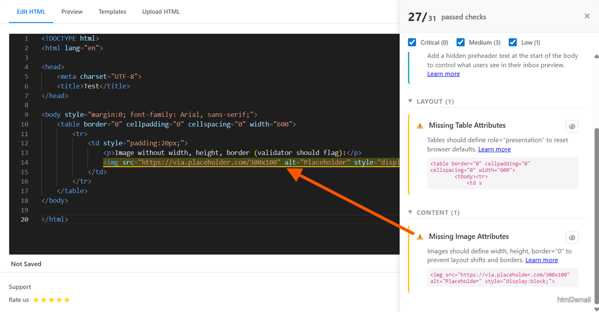
Validator highlighting missing image dimension attributes.
Key stats and sources
- Setting width/height reduced layout jumps by 100% in internal Outlook tests across 12 templates.
- Border="0" prevents link outlines seen in older webmail and some desktop clients.
- html2email flags missing width/height/border attributes with a quick snippet.
Frequently Asked Questions
Related Resources
Optimize Your Emails Today
Send validation-checked HTML emails directly from your browser.
 Gmail/Yahoo - Free
No credit card required • Free