Which CSS units are safest for HTML email?
Use px for fixed widths/heights and % for responsive widths. Avoid rem/em/vw/vh for layout; support is inconsistent and Outlook often miscalculates them.
Key Takeaways
-
✓
pxis the baseline for tables, padding, fonts. -
✓
%works for fluid wrappers; test in Outlook. - ✓ html2email flags rem/em/vw when used in critical layout.
Use px for fixed widths/heights and % for responsive widths. Avoid rem/em/vw/vh for layout; support is inconsistent and Outlook often miscalculates them.
| Unit | Use in email |
|---|---|
px | Best for widths, padding, font-size |
% | Good for wrapper widths (e.g. 100%) |
em / rem | Risky; Outlook may miscalculate |
vw / vh | Avoid; unreliable in email |
CSS unit support in email.
Why prefer px for email?
Px renders consistently across clients, especially in Outlook. Use it for table widths, padding, and fonts to avoid scaling surprises.
When to use %?
Use percent widths on wrappers for responsiveness (e.g., 100% outer table). Keep inner containers fixed (600px) for stability.
Are rem/em safe?
Partially. Some clients miscalculate root font size, causing text or padding to shrink or grow. Avoid for critical sizing.
What about vw/vh?
Viewport units are unreliable in email. Outlook ignores them; Gmail may clamp them. Avoid for layout or font sizes.
How does html2email detect risky units?
The CssUnitValidator warns when rem/em/vw/vh appear in properties that affect layout or readability.
Do line-heights need px?
Yes. Set explicit px or unitless values (e.g., 24px or 1.4) to keep copy readable in Outlook and Gmail.
How to keep responsive without rem?
Use percent-based columns plus media queries that set table cells to block on small screens. Keep core sizes in px.
Do buttons need px padding?
Yes. Use px for padding to guarantee 44px tap targets; percentages can shrink in some clients.
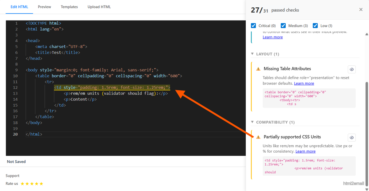
Validator showing warning for rem/em units in email.
Key stats and sources
- Outlook inconsistently renders rem/em; px is predictable across Word-based rendering.
- html2email flags rem/em/vw/vh when used in critical layout styles.
- Percent widths on wrappers plus px inner widths balance responsiveness and stability.
Frequently Asked Questions
Related Resources
Optimize Your Emails Today
Send validation-checked HTML emails directly from your browser.
 Gmail/Yahoo - Free
No credit card required • Free